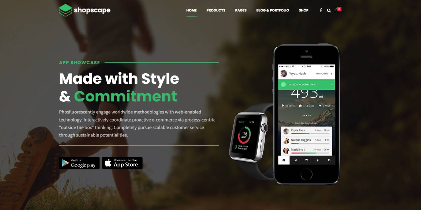
Landing page ecommerce website
Single products ecommerce website design for all products (single vendor)
About this gig
Designing an eCommerce landing page is all about creating a visually appealing, conversion-focused page that grabs a visitor's attention quickly. It encourages action before they go somewhere: perhaps purchase, sign up, or learn more. Below is a very comprehensive concept for an eCommerce landing page:
1. Header
Visuals:
Logo: It occupies the top left-hand side. It identifies and references the brand.
Navigation Bar: Minimalist and clean navigation bar that includes links to "Shop," "New Arrivals," "Sale," "Contact Us," and "Cart."
Search Bar: There is a visible search bar so products can be found quickly.
Call-to-Action (CTA): A prominent "Shop Now" button that will cause impulse actions
Design:
Sticky Header: A sticky header feature will always be visible as the customer scrolls down which keeps menu access and cart access at all times.
2. Hero Section
Images:
Full-width banner: A good photograph or video of the product or collection shot at an interesting angle. Perhaps a seasonal page for running a promotion or showing off a highlighted item.
Headline: An attention-grabbing headline: short and catchy, conveying in as few words as possible what the main message of the page and/or offer is, for example, "Discover Our Summer Collection" or "Up to 50% Off."
Subheadline: A lesser description, further emphasizing the message and/or offer.
Top-level CTA Button: Large button "Shop Now" or "Explore Collection" that sends the visitor to the product pages.
Design:
Color palette. Use a color palette fitting for the brand identity, yet also colors that create the intended emotions for the particular promotion or product - bright bold for something that is a sale and pastel soft for the new collection.
Headlines and CTAs need to be in large, readable fonts
3. Featured Products/Collections
Layout:
Grid or Carousel: Display a few featured products or collections. All product images must be clickable, linking to the corresponding product page.
Product Details: Name, price, and short description
Quick View: More information will be revealed without going off the landing page
Design:
Hover Effects: Subtle animations of images when hovered for more interactivity
Consistent Styling: Same image size and styling on all images for consistency
4. Promotional Area
Images:
Banner images or Promo Boxes: Displaying always available sales, discounts, or offers. Sample usage can be "Free Shipping on all orders above $50" or "Buy One Get One at 50% off."
Countdown Clock: In cases where promotions are valid only for a short time, having a countdown clock builds the urgent sense.
Design:
Contrasting Colors: Using colors that really pop out to the eyes viewing the page as a method of call-to-attention on the promotional content.
Clear CTAs: For a higher click rate there must be buttons like "Shop the Sale" or "Get the Offer".
5. Testimonials/Reviews
Layout:
Customer Testimonials: Display very few impactful testimonials of customers along with their names and photographs.
Star Ratings: Visual star ratings
Product Reviews: In case it's possible, brief product reviews should be shown otherwise link to them
Design:
Keep this section clean and highly simple to keep focus on the testimonials only.
HIGHLIGHT KEY POINTS: Using bold or colored text to highlight specifically moving testimonial sections.
6. Trust Signals
Images:
Icons: Use icons that will associate easily with trust-related factors such as secure payments, money-back guarantees, or fastest shipping.
Certifications: If relevant, display badges or certifications (SSL Secure, Eco-Friendly).
Design:
Minimalist: These should be the most noticed, yet not the most obtrusive elements, ideally located at the bottom of the page, or right above the footer.
7. Newsletter Sign-Up
Layout:
Sign-Up Form: A simple two-field form that incorporates a name and email, with a title like "Stay Updated with Our Latest Offers."
Promotion: Incentivize sign-up with something like a discount code, free shipping, or a gift on the first purchase.
Design:
Pop of Color: Use of color different than on the rest of the page to draw attention to the sign-up form.
Gentle Animation: This is one of those subtle animations that can attract a user's eye without being too intrusive.
8. Footer
Elements:
Use Rapid Links: These include links to important pages on your site, such as About Us, FAQs, Contact Us, Privacy Policy, and Terms of Service.
Social Media Links: These are icons linking to the brand's social media profiles.
Customer Support: you should offer a contact number, email, and even live chat.
Newsletter Subscription: another opportunity to subscribe to the newsletter.
Visuals:
Consistent Branding: It uses the same color and fonts used elsewhere on the webpage.
Clean Structure: Avoid overwhelming a footer by using clear differentiations between different kinds of sections and keeping the one well-structured.
Reviews
₹4999
Single products wocommerce website design+ payment gates, shipping + Govt guidelines for ecommerce
5-Days Delivery
1-Revision


