Grocery Website Design
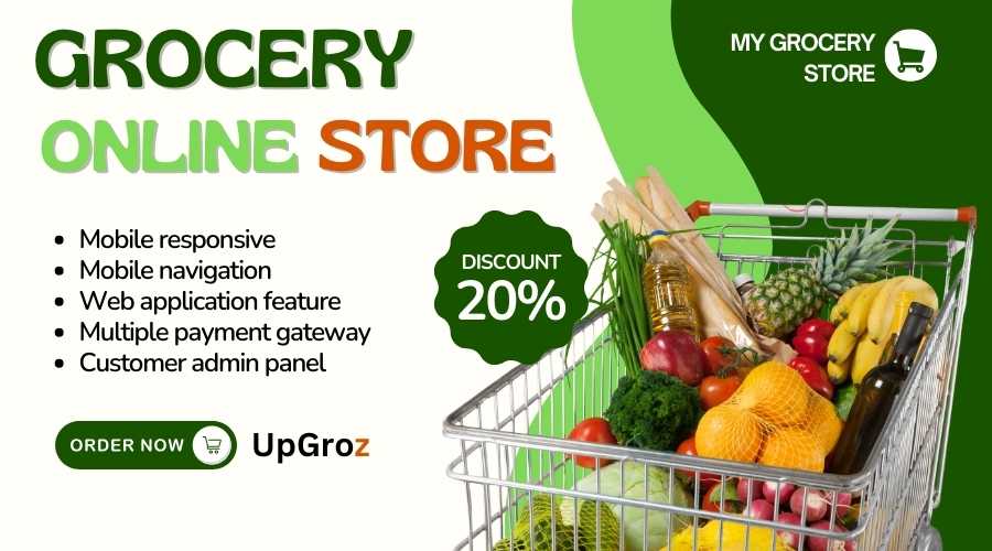
online grocery website design with mobile responsive features
About this gig
The designing of the grocery site includes functionality aesthetics. In a grocery site design, an efficient friendly experience will have incorporated functionality aesthetics. Now let us start with what an attractive yet effective grocery website design makes.
1. Home
Header:
Logo: The logo is your face yours. Your logo needs to be clear and distinguishable and at an apt location making a first great impression.
Search Bar: The search bar is essential for those who know what they're looking for. It should be easily spotted and used.
User Account Icon with Dropdown: Features like sign-in, viewing orders, and wishlist create a more personalized experience for the user.
Cart Icon with Item Count: Showing the item count in the cart increases urgency and prompts checkout sooner.
Main Banner:
Featured Products or Deals of the Day: Showcase the best products or special deals that grab attention immediately.
Advertisement Banners: Promote seasonal items and offer limited time to attract shopping.
Categories Section:
Visual Categories of Diverse Products: Specify sections like Fruits & Vegetables, Dairy, Snacks, Beverages, etc. It not only looks great but also helps users find what they're looking for.
Popular Products:
Carousel of Popular or Hot Items: It is always a good idea to show what others are buying, as it boosts confidence in purchase.
Exclusive Deals:
Attract special deals or discounts. Everybody loves a bargain!
Footer:
Customer service, privacy policy, and terms of service must be easily accessible with links.
Social media icons in the footer.
Newsletter Signup: Allow users to sign up for promotions and updates from the very homepage.
2. Product Listing Page
Filter Options:
Allow for filters by category, brand, price range, rating, and diets like organic or gluten-free. This is where the health-conscious shopper is going to get the most support.
Sorting Features:
Offer the ability for the products to be sorted by popularity, price, or newer as their kind of personal shopping behavior dictates.
Product Grid:
Show the images, name, price, and "Add to Cart" buttons in a neat grid view. Everybody loves to browse effortlessly with no hassle.
Quick View:
Give users an eyeball glance at the product information without having to move anywhere for a better browsing experience.
Pagination:
Use crisp page numbers or have an easy "Load More" button to avoid pushing the user's patience.
3. Product Detail Page
Product Image Gallery:
Many images so the customer can zoom in to get a closer look at the product. The more detailed, the better.
Product Information:
Name
Price
Quantity selection
Describe the product totally and don't forget:
Nutrition information
Ingredients
Customer reviews-it's always soothing to see what others think.
Action Buttons:
Add to Cart
Add to Wishlist Create options for the potential buyer as to how they would like to proceed. The more opportunities customers have, the more likely they are to purchase.
Recommendations of products based on what people are browsing might entice them to buy even more.
4. Shopping Cart
Summary List of Items:
Make a list of items with pictures, names, prices, quantities, and total amount with clear visibility.
Choices:
Allow the user to change the quantity or remove items easily. A happy customer is a satisfied customer.
Checkout Button:
A simple CTA call to action to complete the checkout must be seen. Simple works!
5. Checkout Page
Delivery Information:
A shipping address form for a well-arranged address, and options for the delivery time, let users check out with no hassle.
Payment
Diverse payment methods such as credit/debit cards, net banking, wallets, and cash on delivery make payments easier for everyone as per their preference.
Order Summary
It should list items, delivery charges, and total amounts clearly to show transparency.
Place Order Button
Having a final button for confirmation makes it easy for users to complete the purchase.
6. User Account Section
Profile Information:
The management of personal data, stored addresses, and methods of payment is useful to the repeat customer.
Order History:
Being able to view previous orders and re-order or check the status of deliveries is reassuring to customers.
Wishlist:
A facility to save products to purchase later can make users visit the website more often.
7. Contact Us Page
Form:
Use fields like Name, Email, Subject, and Message. Simple!
Customer Service Details:
Provide phone numbers, emails, and live chat options for swift help.
Location:
If you have a brick and mortar, then provide a map to show the location of your stores. Such a great feature for store location.
8. Mobile Responsiveness
Responsive design is a must. Make sure that your grocery website is responsive on both desktop and mobile devices. More shoppers are buying on their phones. Therefore, it's necessary to make a seamless experience for your shoppers on mobile.
9. SEO and Performance Optimization
Fast upload times, search-engine-friendly URLs, and meta tags can dramatically improve the search engine rankings for your format. And don't forget to optimize images and reduce the number of plugins for improved performance.
Engage your customer base while ensuring a seamless shopping experience which can make all the difference in the competitive world of grocery websites.
Reviews
₹2999
Website Template
1-Days Delivery
1-Revision


